A UX review of Clear, todo list manager of the future
Meet Clear, the todolist manager that does everything right. [vimeo 35693267 w=400 h=225]
Clear for iPhone from Realmac Software on Vimeo.
Intuitive interface
Clear has no interface. It just uses swipes pinches and touches in a list the same as you would on an image. While there is no such thing as intuitive, this is as close as I’ve ever seen.
But the best part about clear is it’s use of color and sounds.
Use of color for information
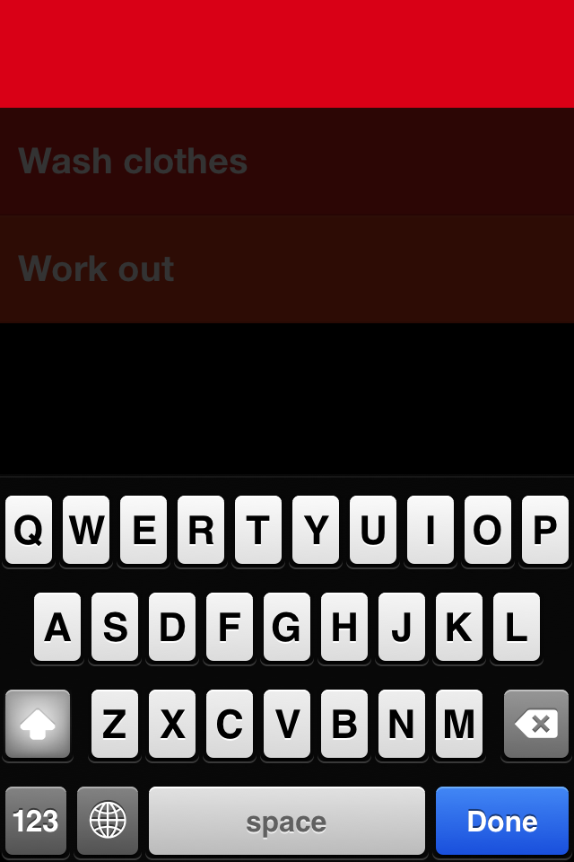
Colors are used in the lists to show priority. The more saturated the color, the more important the task. Now the tasks are already in a list, so one could argue that adding colors to it is redundant. But this is not true. Any human scanning a list will see each item as equally important. Most of us tend to try and put the most important thing at the top of the list but every time we look at the list we still browse more than one item.
Making the list colored gives a subtle hint that you don’t need to look at other tasks. This is the one.
It also gives the user a reason to order the list properly. While the app never tell the user they have to, just creating a rule that says the top is higher priority will make users want to use the rule. Think of it like a hidden keyboard shortcut. Once you learn it, if it’s a valuable shortcut, you stick with it.
Sounds that make it fun
Audio feedback has been used to great effect in games for decades. Which is why I’ve always found it odd that it’s had such little attention in software tool design. Until now.
Clear has a sound effect for every function.
New item? Pop.
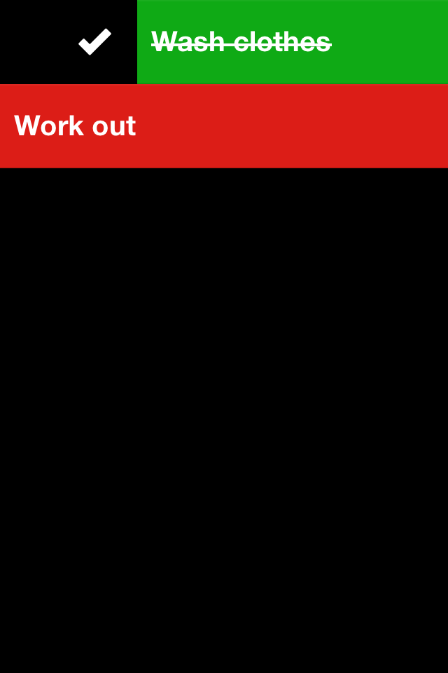
Finished item? Ping!
Delete item? Swoosh
But I really mean sound effect. These aren’t just midi notes annoyingly stacked to make an awful racket. These are effects that sound great by themselves and stack neatly. What do I mean by stack? If you complete several tasks in a row, you don’t just get an annoying amount of pings. You’d hate that. Instead you get a rising scale of pings that together seem to form a rising crescendo. Which incidentally is exactly like the normal sound design to gaining point in video games (remember picking up coins in Mario?)
UPDATE: The awesome sound design was done by Josh Mobley.
Getting out of the way
The reason the design of Clear is so impressive is that, while the UI reinforces the users positive emotions of using a todo list, it get’s out of the way to let the users focus on thinking about tasks.
There’s simply nothing else to think about. And you won’t get those soothing sounds of completion if you don’t complete some tasks.
Summary, or: is it awesome?
Clear is the best interface for getting things done I’ve seen so far. On any platform. It’s also responsive like few apps on iOS.
It does gamification right by letting the user learn it’s features intuitively and reinforcing the actual use of the product instead of showering them in useless badges.
Sadly however, it also really doesn’t have a use. At least not for a todo-list power user such as myself. Enter a 100 tasks into Clear and you’ll be looking at an infinite list with no overview. There’s no search, there are no smart lists. But these features would not improve the product. In fact, I think including more features could destroy the product.
If you use lists often but don’t have 1000 tasks in them. This app will make you smile on your way.
If you use really long lists, this app will be nice to play with but not useable.
Should you buy it? YES. If only to support good design.
As usual, the Verge has the best video first look:


