New iTunes Redesign
iTunes is long overdue an overhaul. The old program has become so bogged down with features one can’t help but wonder when Apple will update it. They might follow their mobile strategy and split into several parts or go for the completely cloud based streaming version a la Spotify.And they might announce it this Monday at WWDC. This is why I thought I’d redesign it while it is still a huge challenge.
My design is based on a rethinking of what iTunes manages, namely media. But lot’s of different forms of media. In this design of iTunes every media item is considered to be a media bit no matter if it’s a song, an album, an app or a book.

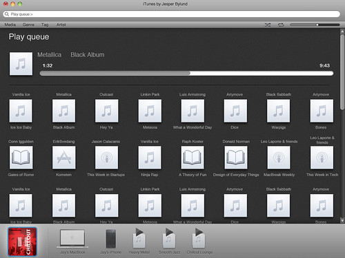
As you can see this design is radically different from the current version of iTunes. I’ve followed Apples recent reductionist standard in design and tried to eliminate everything unnecessary while retaining the purpose of the program.
There are three main areas of interest in this design:
- The top navigation bar which holds filters, search and player controls. Allowing users to easily find what they’re looking for.
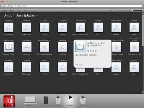
- The media view which allows users to browse through media, partly for fun and partly for aimless just looking. It also gives a great overview of what types of media and with modal boxes for more information can give users details if they want.
- The bottom devices dock. This is where media is divided to the available devices as well as start and stop the currently playing list. I’ll explain a bit more about devices below.
The start screen shows you the available devices as well as your favorite and most recently used media bits, this way the user instantly has an overview of where they left off last time.

I’ve considered devices to be anything that has media in it. From left to right:
- The currently playing list displaying the artwork for the currently playing media with a simple play/paus control for the queue. Users access the queue by clicking this icon or just drag and drop media to it to add it to the queue.
- The computer library. WIth home sharing different computers can share with all devices over a home network, I’ve just eliminated the extra fuss by reducing it as far as I’ve been able.
- Peripherals, in this case my iPhone. Used in the same way as computers, playlists and the queue. Drag and drop or click to view contents.
- Playlists, drag and drop media to and from and click to view.
A lot of people use playlists as a way to traverse their media libraries. I have actively made this harder as playlists are a lot more harder to search through as media libraries grow. Instead I’ve focused on search and filtering to allow easy browsing of the library. I have however thought this to be a perfect place for Apples famous horizontal scrollbars should the number of devices increase.

Filters are used to group media bits making it easier to find what you’re looking for in a large library, seach is however crucial since most people tend to grow really large media libraries. Click a filter and all media is displayed as stacks or bits, click one suck stack or bit to see it’s contents and either filter further or search the stack.
The currently playing queue acts as both a queue for media and as the main media player. It’s a simple principle to learn and as all devices work in the same way the user needs never get confused or irritated at features appearing and disappearing depending on context.
Media bits can be freely moved between devices, making sharing and syncing simple and easy to understand.
Each media bit has detailed information available only if the user wants so know more.

The player controls have been moved aside leaving only the large play and pause button on the icon for the currently playing list/device. I’d love to get some more work done on this project in the future but I think Apple might beat me to it. And I’m excited by the thought of comparing my work with that of Jonathan Ive’s team!
There are a few weak points in this design so far, namely the lack of the iTunes store and the lack of a way to arrange Apps on devices. While I’ve thought about solutions for these and believe that this design can accomodate them I haven’t had the time to sketch it out yet.
Hope you like my work, and if you’re reading this Mr Jobs; yes, I’d love to come work for you. ;)
See higher quality versions of this design at Flickr

