UX trend predictions of 2012 A:
Whenever likeminded creative people try to innovate trends emerge. Ideas give birth to ideas. As ideas keep combining in the heads of creative people everywhere some ideas become more sticky than others. I’ll document some of the trends in user experience design I predict will become the norm in 2012. An example trend from previous years is the scroll down to refresh design. Created by Loren Brichter for his famous Tweetie iphone app it has since become the standard for refreshing feeds and lists in apps everywhere.
[youtube https://www.youtube.com/watch?v=Js\_EjlH-UbQ\]
Example from mobile webKit build
Related function Panels
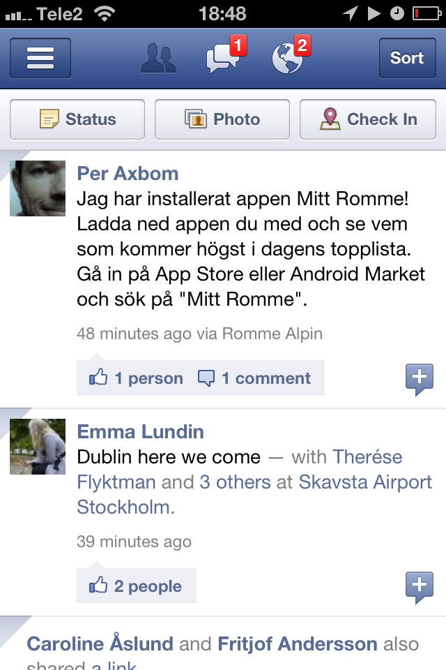
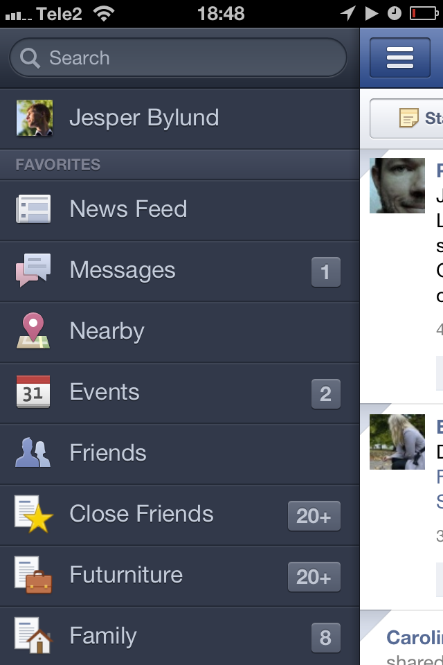
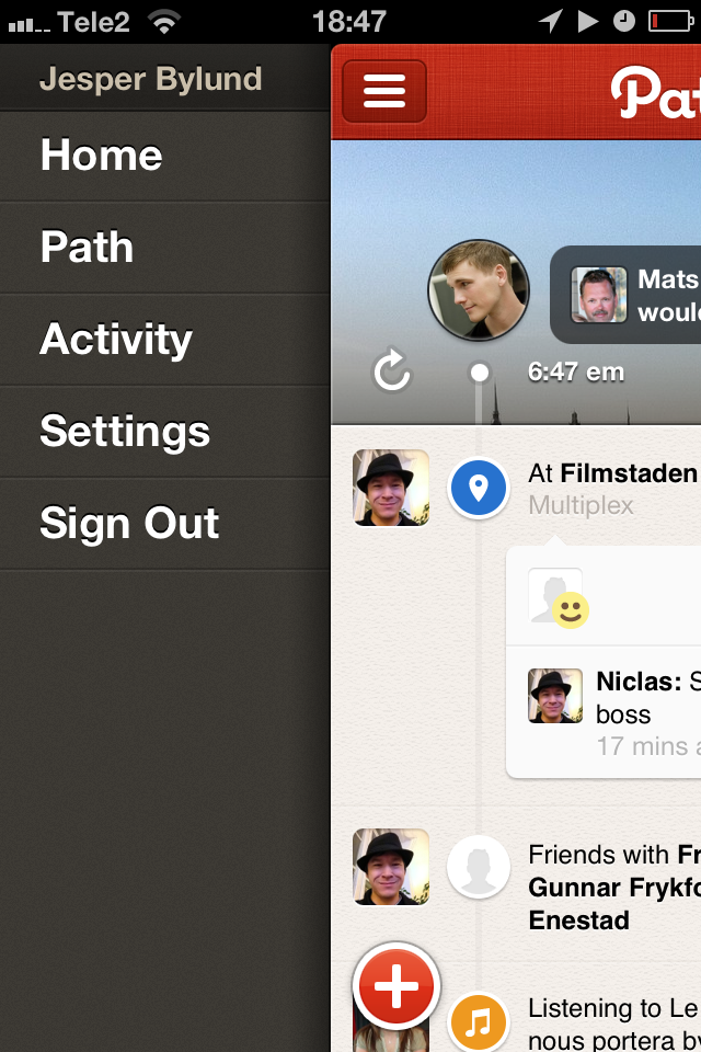
You’ve seen them already. Open your Facebook app and look at the button in the top left corner. Tapping the button or swiping the interface from left to right opens the menu:
This background panel is always there. Neatly integrated in iOS navigation panel.
The iOS navigation panel? At the top of all iOS apps with many views is a bar that usually has two buttons on it. This bar is called the navigation bar in the iOS SDK and intended to be used like this:
- the left side button steps you back in the app. Just like the back button in your browser.
- the right side button steps you forward. Showing the next step or function in the app.
Related function panels will become a trend become complex apps need menus, and no one wants to start the app in a menu. Instead starting the app smack in the middle of activity giving the user an option of accessing the menu by “stepping back”.
Why is this different from a menu
But the reason I call the panels related function and not menu panels is that when a menu is that as soon as we have this paradigm, panels on either side that are “behind” our current view in chronological order. We can show the user all sorts of related information and functions, regardless of the apps functions.
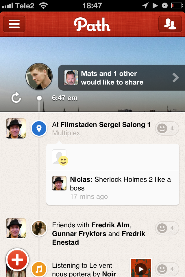
Take for instance Path 2.0, a beautiful example of UI design. It too uses the left side menu, but to the right it shows your friends list. In the Facebook app this right side button opens sorting options and not a panel at all. This doesn’t matter. As long as the paradigm is in place, panels will start showing up with the most important related functions in apps of all sorts.
Is this good or bad
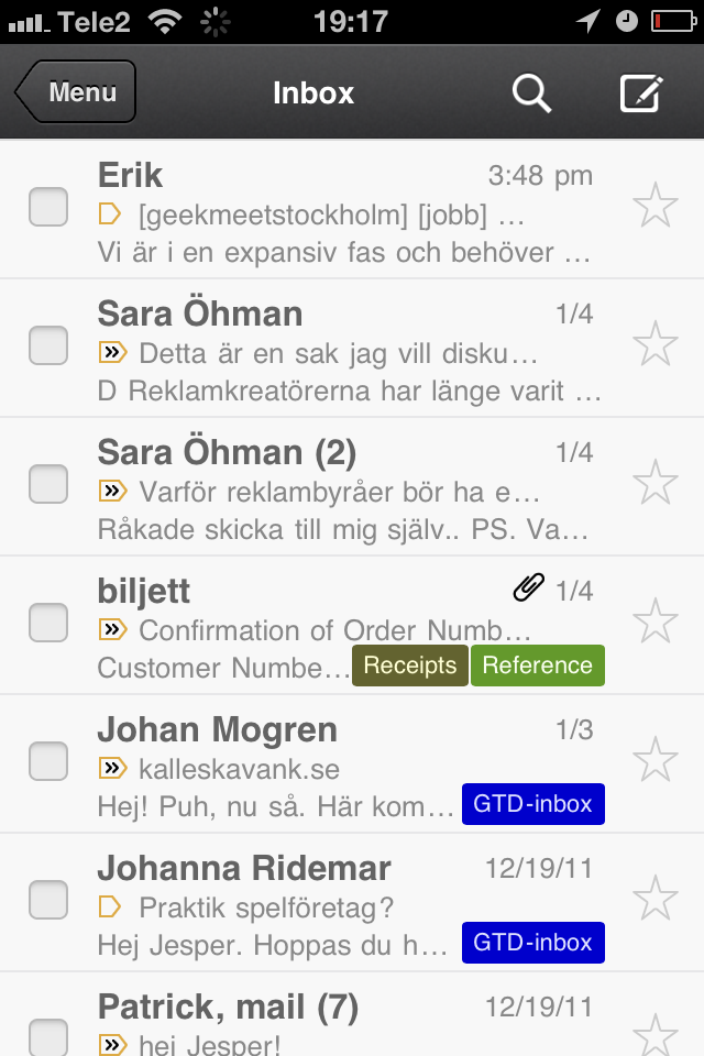
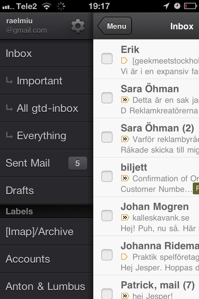
The design works great in the Facebook app, in the Gmail app and in Path 2.0. But if it will work when lots of apps join the trend? We can’t know beforehand.
The design is solid from a perception and usability perspective. It also looks great. So I’m hoping to see some innovative use of it shortly!
