Twitter is the Twitter-killer
Twitter, the micro blogging service, has taken the world by storm. While there are only a few hundred million users compared to Facebook’s massive near Billion, the service has become the place to share real time updates and is often used to gauge peoples reactions by news and analytic firms because the platform is open. But Twitter is about to face it’s doom While Google struggle to reproduce the viral effect of micro blogging services Facebook’s grab for the real time feed was hampered by the need to privacy. Twitter has already gained wide acceptance and was never intended for private information in the first place. But a series of ominous events are slowly hollowing out the foundations of Twitter.
Twitter is being killed by… Twitter has never been the most stable of tech startups. The service used to be plagued by downtime which became so frequent the Fail Whale error page became as famous as the service. The company itself is also changing management again, and again. Not a great trend this early in a one product company. The lack of leadership is clear to see.
Twitter UX Twitter (the company) is constantly changing and evolving it’s product. Which is a great way to organically fit the needs of their users. But Twitter (the company) is doing this in a somewhat odd way. It started when Retweeting (passing on another users tweet as a sign of encouragement while marking it with their name and RT) was made a part of the product, after it’s wide adoption by users, Twitter (the company) decided to implement it differently than the usual Retweets. This lead to better statistics, but also a fractured UX as apps now had to implement both ways to RT because users didn’t like the new one. Eventually Twitter (the company) incorporated the old style Retweets but called the function Quote Tweet instead. And the problems were just getting started.
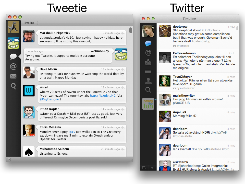
Twitter app insanity Twitter apps were almost a category on their own in the beginning of the Appstore. Twitter has become so important to mobile phone manufacturers they always showcase a twitter app with their new flagship phones. But Twitter wanted to control the experience, like Apple. Maybe a good idea. But really bad execution. They bought Atebits, the developers behind the most popular Twitter apps for iOS and Mac. Have you ever pulled down a list to refresh? Atebits invented that. So why was this a problem? Sounds great, right?
After being purchased by Twitter (the company), the newly renamed Twitter for Mac and Twitter for iPhone started being updated less frequently… Let me make that clear, having the developer of the apps work closer with the Twitter development team made them update the apps less often.
Then shit really hit the fan. Twitter (the company) redesigned all their interfaces to be similar across platforms. Starting with a roll out on iPad, then web then the rest, Twitter (the company) streamlined their interface development.. in theory. What really happened? The interfaces now looked the same, but they didn’t work the same. In fact, certain features only exist on certain platforms even though the interfaces look the same. Which makes it really hard as a user to remember what you can do where.
Later on the developers behind Atebits have left Twitter (the company), possibly in raging despair. And Twitter (the service) is fracturing into a mess. Not just between interfaces but functions as well. For example with the roll out of the activity tab you can follow some of the things people are doing through Twitter, following, unfollowing, making lists and so on. These features, which btw totally contradict the extreme simplicity of the core product, are weirdly integrated into the web interface as the afterthought they are. And it’s only available on the web.
Summery Twitter (the company) is destroying Twitter (the services) with some sort of odd design-by-committee culture. No matter if you like or dislike these new features, the case is clear that teams behind Twitter (the service) definitely aren’t working towards the same goal.
This is sad. Because I love Twitter (the service). And I don’t like that it’s being killed by Twitter (the company). Please RT this if you agree.
Update:
Apparently the sentiment is echoed by people leaving Twitter (the company).
Update 2:
In December 2011 Twitter updated their entire line of interfaces. The design changes were clearly aimed at making Twitter a lot more interesting for new users.
Twitter divided itself into different parts, seemingly with different uses:
Sounds great right? What could possibly be the problem!
Twitter didn’t actually change. And Twitter (the service) does not actually have these different areas of interest. So any user checking them out will quickly get confounded. What is the difference between “Home” and “Me”? I have no idea. But to make this obvious, Twitter (the company) has removed Me and Tweet from the web interface which basically means they have these left: Home (My feed), Connect (replies, RTs and follows) and Discover (search damnit, it’s just search!).
To make things better worse, the UI is even more fragmented. Twitter no longer has updated clients for iPad and Mac. Apparently the job previously done by one single guy is just to much for an organization of 300 or so.
But it get’s even better worse. The UI of the web and iPhone version, while both being updated simultaneously for this new paradigm, still do not follow the same UI standards and are structured differently. Don’t ask about Android. Twitter (the company) must really, really, hate Android.
Anyone want to build a Twitter killer, possibly built upon the API of Twitter to simplify the transfer of users? I’m available right now.

