Path 2.0 UX review
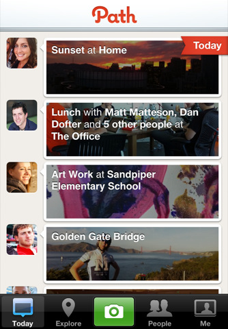
Path was a weird app when it launched about a year ago. It was a photo sharing app with checkins, directly competing with Instagram and Foursquare but without the simplicity. It also had the really weird USP that you could “only share with 50 of your closest friends!“… Now, most people don’t have more close friends than that. Hell, most people don’t come close to that. But the early adopter crowd that usually takes these new apps for a spin were appalled. But Path was beautiful.
It didn’t work.
But Path is back! Path 2.0 is better, faster, turbo, everything you could possibly want. But is it good enough?
Path first impressions
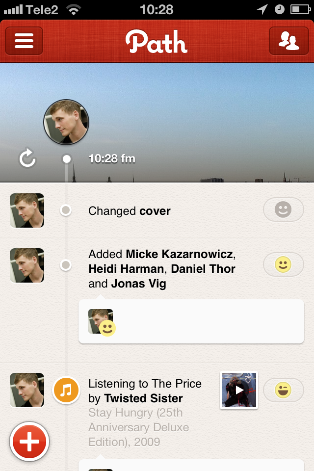
Path is incredibly beautiful. No other mobile experience comes close. Seriously, it’s not just pretty graphics, all the animations and interactions, the structure of information, the loading bars and even the damned typing experience is just plain better than in other apps. It’s amazing.
So what is Path?
Path is a digital diary for your life. Everyone on Path has a feed. And at any time you can add stuff to your own: where you are, a piture, who you’re with, music you’re listening to or when you go to sleep.
Using Path
Is lonely. Sure it launched today but that’s not the main issue. Path is clearly going for the same feature set as Facebook Timeline (which is tied up in court and has yet to launch) but there’s no way you’ll get all your friends to come over. I’m an early adopter. I talk to a lot of other early adopters. And I’m still lonely on Path.
Still, it’s an amazing experience. Enough to make me want to use it. Maybe that’s enought? I’ll update in a few days and let you know.
[vimeo 32856179 w=686 h=386]

