Designing in-app purchases that work
With the rise of mobile, more and more people are looking at in-app purchases to monetize their products and services. But, as usual, there are design aspects to think about. I this article I intend to explain two of the most important things to think about when designing for in-app purchases: Relevance, and Access.
In-app purchases are really nothing new. It’s just the name for how to buy extras in apps. We’ve been buying extras for decades already: “cheaper rims with the car”, “buy two jumbo sized bags of spam for the price of one!” and the list goes on.
What is different this time around is that these extras are virtual. You’re more or less buying the use of a few more lines of code. This makes the value proposition for the customer very different from the real world extras we’re used to. Which makes relevance and access more important than they would be for fuzzy dice.
Relevance
Relevance is the most important aspect for an in-app purchase. If the extra on sale isn’t relevant, why would you care? But if the fuzzy dice at the car dealership are exactly what your wardrobe needs, perfect!
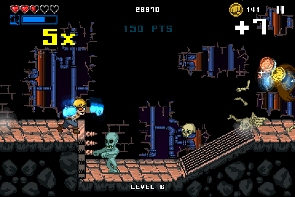
Take Punch Quest for example. Punch quest is one of the most popular games to hit the AppStore in late 2012. But despite having millions of downloads and tons of active players, Punch Quest didn’t make much money. It’s was a free app, and great game, but the in-app purchases lacked relevance.
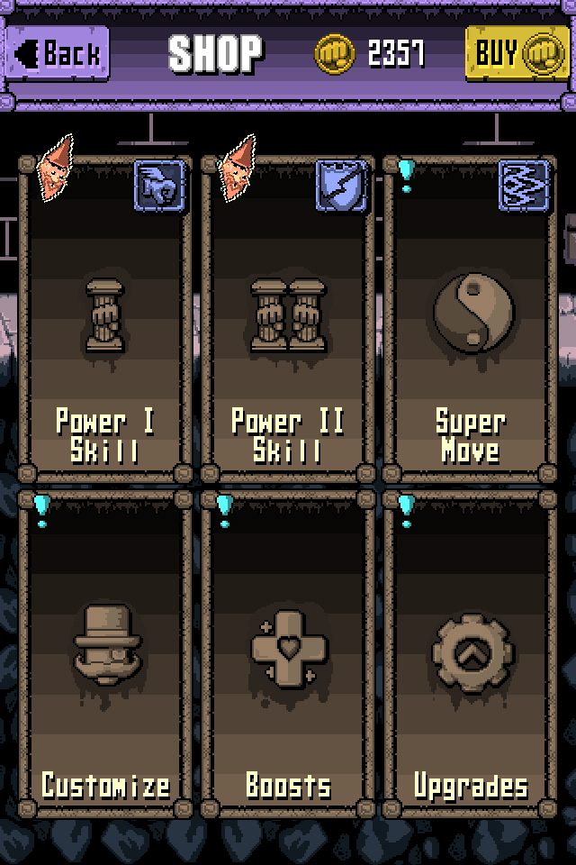
The extras you could buy for Punch Quest were… Odd. They either didn’t have impact on gameplay, being visual gimmicks, or they did but had strange, nondescript, names. I even bought some to support the developer, and I still have no idea how what I bought impacts the game. Without relevance, your in-app purchase is doomed to fail.
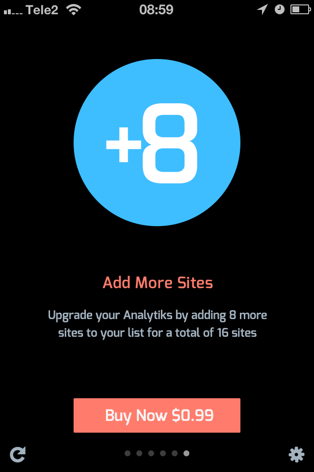
Compare that to Analytiks, my favorite iOS web statistics app. While popular, it’s nowhere near as popular as Punch Quest. Yet it’s much more successful. The in-app purchases in Analytiks are very relevant. Analytiks shows you a screen for every site in your google analytics account. Just swipe for the next site. But it’s limited to 8 sites. After 8 sites instead you find a screen offering another access to neither 8 sites for a small sum. Brilliant. Instant purchase when needed. If you don’t want to pay extra, you still have full control of which 8 sites are shown.
Access
The other important aspect for in-app purchases is access, which loosely translates to “ease of use”. Ever found a business that seemed to not want to take your money? They had poor access.
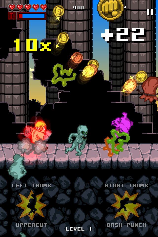
Punch Quest has in-app purchases, but they are not a part of the actual game. You can play for hours without having any idea there is anything to buy in the app. Worse, when you navigate through the menu structure it’s still hard to find.
The customer first needs to want upgrades for the game, most of which are quite hard to understand if you haven’t played extensively. Then the customer has to run out of coins collected in the game with which to buy upgrades. Then, finally, they need to find a small call to action hidden in the navigation bar. Not very accessible even for advanced users. Terrible for casual players looking for an advantage in the game.
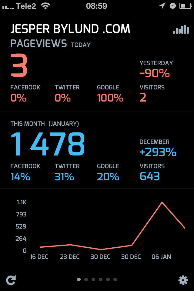
Analytiks does it right. In the main app, after your sites, you are presented with the upgrade where the content ends. The screen is uncluttered and has only one message and call to action, the cta is clearly labeled with the price. Making it a simple few clicks to make the purchase, there is no lack of information, not ambiguity, about the product that makes the customer want to think it over.
Summary
If people are already using your product or service. Chances are they might be open to extras or upgrades.But by making them relevant to the use case, and making them accessible for the user, they become useful extensions to the app. Which are much more likely to sell.
-
Relevant:
-
expands the product
-
solves specific problems
-
not removing artificial limitations in the product
-
Access:
-
clear and understandable purchase information
-
presented well for the use case
-
not a “bolted on” design or user flow