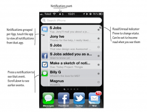
A new iOS notification design
Something I don’t get about most current design is that designers adding features always add layers of complexity. Never add things unnecessarily.
This is my design for a new Notification system. The notification counter on top will ping in color and sound/vibration when new notifications drop in. The user can set which service does what in settings.
The entire notification list is under the spotlight window. If you use spotlight, it’ll disappear until you remove your search.
UPDATE:
iOS5 has been unveiled and while I’m not shocked to find I wasn’t spot on, I am a bit shocked by their adding another menu just for notifications. If you have no idea what I’m talking about check em out here.
Category design
