ux review of chrome for iOS
Google services have been a long time coming for iOS users. While most people’s immediate response to that is to say “of course, they have android” I think it’s weird for google to neglect 400 million customers of their services just because they want to promote another mobile platform. Android already has a majority market share after all.

Oddly enough, Chrome became the first really native iOS app by google. Odd because Apple is severely restricting apps that compete with iOS native functionality, and the browser could be said to be more important for iOS than the actual phone app…
Chrome launched with a slew of welcome mobile optimizations for a browser that apple has since copied to their own app, safari. Syncing not only accounts, but history, tabs and even sessions didn’t exist on iOS before chrome. But for all it’s glory, such as less browser chrome and actually useful tabs, Chrome also has a number of weaknesses.
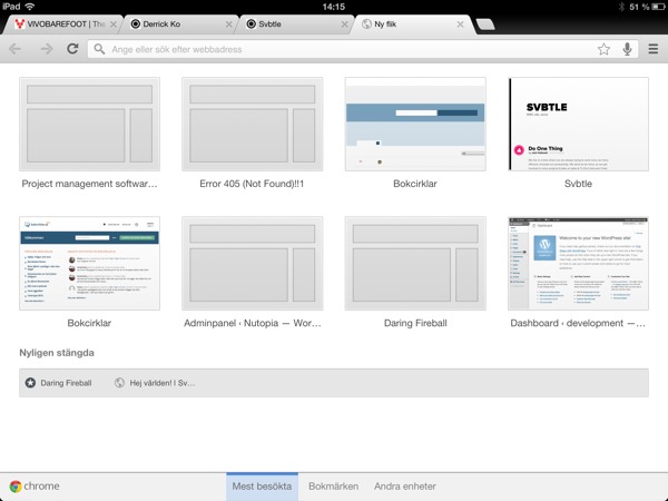
Tab refresh
When I switch between tabs in chrome, something goes terribly wrong. For all the fast loading and fast tab switching goes straight out the window as I am forced to wait for a page refresh. This might sound like it makes sense as first, most pages need to be refreshed before I can see any new content after all? But I often switch between apps, while reading, looking something up or for any other reason. The several clicks and wait that safari makes me do to access my other tab is bad enough. Forcing me to wait for a full refresh, and especially on a mobile network, just breaks the experience. Why would I keep waiting? F this. I’ll be on Facebook.
I’m sure I’m not the only one who feels the same way, but I haven’t gotten any word from google on whether they are working on this or not.
The dark UI
Google has always had a light, cheerful, design aesthetic. It might not fit everyone but its google. With recent android generations they’ve stepped back from this to offer a darkes, softer, design. Chrome fits perfectly into this. Except of course, that its on iOS where nothing is dark.
Not only does the app look like android rather than google, but it doesn’t fit into its environment at all. It’s I’d just a plain bad design decision. With the reasons why painfully obvious.
Summery
Just a few days ago Google released new, native, apps for gmail and YouTube on iOS. Both of these apps show a lot of promise, especially for design. So I’m hopeful that google will get around to fixing these issues with chrome soon.
Though I still wonder why google feels its services are worth more to customers on android? Int google all about the services? Why deny iOS users google now? I’m a google ecosystem user since 2007, nothing so far has made me change my mind. I’m also an apple device user since years back. Apple allows me to use google services, why won’t google?